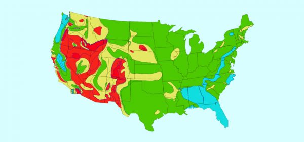
Data is great. Who doesn’t love going through sheets of data? I don’t! After about 10 spreadsheets, things can start getting a little fuzzy. This is why there is no one type of data and not even one way of getting and deciphering it.And this is where heat map visualization comes in. It is one of the best ways of understanding data. Quite opposite to its popularity it is easily misunderstood on the accounts of it being a little ambiguous and complex.
But not anymore.
This article will help you understand this easy and visual way to know and befriend your data so that you can make the best decisions for your organization. So let’s look at what it is, when to use it and the benefits of it:
What is heat map visualization or heat map data visualization?
A heat map is a representation of your datasets like number of viewers, sales numbers, etc. on a visual interface of a map or website. Again contrary to the popular understanding of heat maps, they are not used only for understanding user behavior on a particular website or an app. This is among the easiest ways to understand anything and get a bird’s eye view. So, you can use it to get a better understanding of X number of things. The complete idea is to show touch points on top of areas, web pages, or geographical areas. How this particular method of understanding data differentiates itself apart from the rest of the fleet is interesting as it lets you see compiled data in terms of colors that are set in order to create a spectrum i.e. low to high [cool to warm].
This makes it easier to analyze said data and make decisions since human beings are better visual learners in comparison to learning with numbers or words.
But why has this method of understanding data become popular among professionals in recent years? Because of the paradigm shift of businesses from offline to online. Since our websites can provide that personal touch when the interaction is happening between you and your customers, there arose a need to understand how and why the interaction was happening so as to make the future interactions better and more user-centric just like a traditional offline business.
The complexity of this method is just beginning. This type of visualization is further divided into different forms/types:
– Heatmap: data presented in the form of warm to cold — warm being the most interacted area whereas cold being the least interacted area.
– Scrollmap: data presented in the same warm and cold form but shows the scrolling pattern or depth of your visitors.
– Clickmap: to understand the behavior of your visitors in terms of where they click. This goes one step further in heatmap and gives you the understanding of interaction at a granular level.
As mentioned before, a particular type can be used for understanding different sets of data. For example, a heat map can be generated of a particular web page where your visitor’s interactions are tracked but they can also be generated to understand sales data of let’s say 20 territories of a particular city or country.
That brings us to our next question.
When should you use heat map visualization?
Even though the concept itself is a little complex, it is best used to understand complex datasets or simply put when you have multiple datasets.
This could easily be used to understand:
– User behavior
– Territory performance [Revenue-wise]
– Comparisons [X sales of 2018, 2019 to 2020,2021]
– Effectiveness of your webpages
– CTA copies [what word works better or gets you a click]
– Button placements
Let’s take an example of leads in one country. Heatmap can help you visualize your active leads on the map of the country. When you enable heat map visualization based on where these accounts are in the sales funnel, you can get a much clearer picture of things. The warmer color will suggest closer to the sales funnel whereas the colder color will suggest difficult to convert.
While one city may have more leads but they might be farther to conversion, another city may have fewer leads in number but they may be close to conversion. Based on this, you can put an active effort to convert those accounts first and then take your attention to the leads which you have just acquired.
Again, it is advisable to be more creative with heat map data visualization since it can accommodate a lot of complex data for you.
To make the understanding of this concept more fruitful, let’s see what are the benefits you can get from heatmaps.
Benefits of using heat map visualization
– Better segmentation of your visitors based on their behavior
– Targeted marketing for better conversion rates
– Targeted sales strategies to gain market share
– Creating a personalized experience for your visitors based on their previous interactions
– Effective marketing copies for better clicks/lead generation
And many more.
Frankly, this list can be endless since the use case of heat map visualization has a wide wide range. So, sky is the limit when it comes to taking the benefit of heat map visualization tools.
A little detail into heat map visualization tools
There are a lot of tools existing in the market but every tool is developed with a use case and niche in mind. Like Hotjar gives you insights into understanding your customer behavior on your website whereas our MappyField 365 is crafted in a way to help your sales team convert more leads into sales as you can plot data on a map and create your sales strategies and manage your territories according to their potential.
So, the right way to pick a heat map visualization tool is first, define the problem, possible outcome you want, and then reverse engineer the type of heatmap that would help you achieve that outcome.
About MappyField 365
It’s a mapping tool that was initially built to map Dynamics CRM records on a map which was further developed into a heat map visualization tool that allows you to understand sales data better. Works like a sales companion for the whole team. This makes it easier to see a concentrated area of contacts and accounts and strategize accordingly. You can take the decision of moving from high response territories to low response ones and adapt your marketing and sales strategies accordingly.
Interesting?
All product and company names are trademarks™, registered® or copyright© trademarks of their respective holders. Use of them does not imply any affiliation with or endorsement by them.


