Do you know that 70 percent of customers abandon their products in the cart? There are plenty of reasons for incomplete transactions. Perhaps they have to pay extra or create a new user account for checkout. Complexities and multiple steps are also the reasons for cart abandonment during checkout.
This is why I came up with this article – to help you optimize checkout.
Here, I will talk about the best approach to boost the conversion rate on Magento 2 mobile app. That way, you can reduce cart abandonments, create a unified experience, and increase sales.
With that said, here’s everything you need to know about the solution, i.e., one-page checkout.
One Page Checkout v/s Multiple Page Checkout
Till a few years back, when online shopping was not as preferable as today, customers relied on a multiple page checkout process, i.e., add to cart, sign-up, add an address, add payment details, and then final checkout.
But now, with technological advancement and increased dependency on online shopping, customers want a quick solution. A solution that lets them purchase with a few clicks. That’s where one-page checkout comes in. It’s a single page covering all the steps from signing up to adding payment details and hitting the checkout button.
One page checkout means customers don’t have to wait for pages to load. It helps Magento 2 mobile app users with a straightforward and quick checkout. It prevents users from frustration with time-consuming and sluggish loading.
Though, multiple page checkout has a business advantage. It lets you collect customer information, but it may lead to drop-offs. In one page checkout, all the checkout information appears on one page. It collects only the essential information, creating a satisfying shopping experience and increasing conversion rates.
Here are some examples of One Page Checkout.
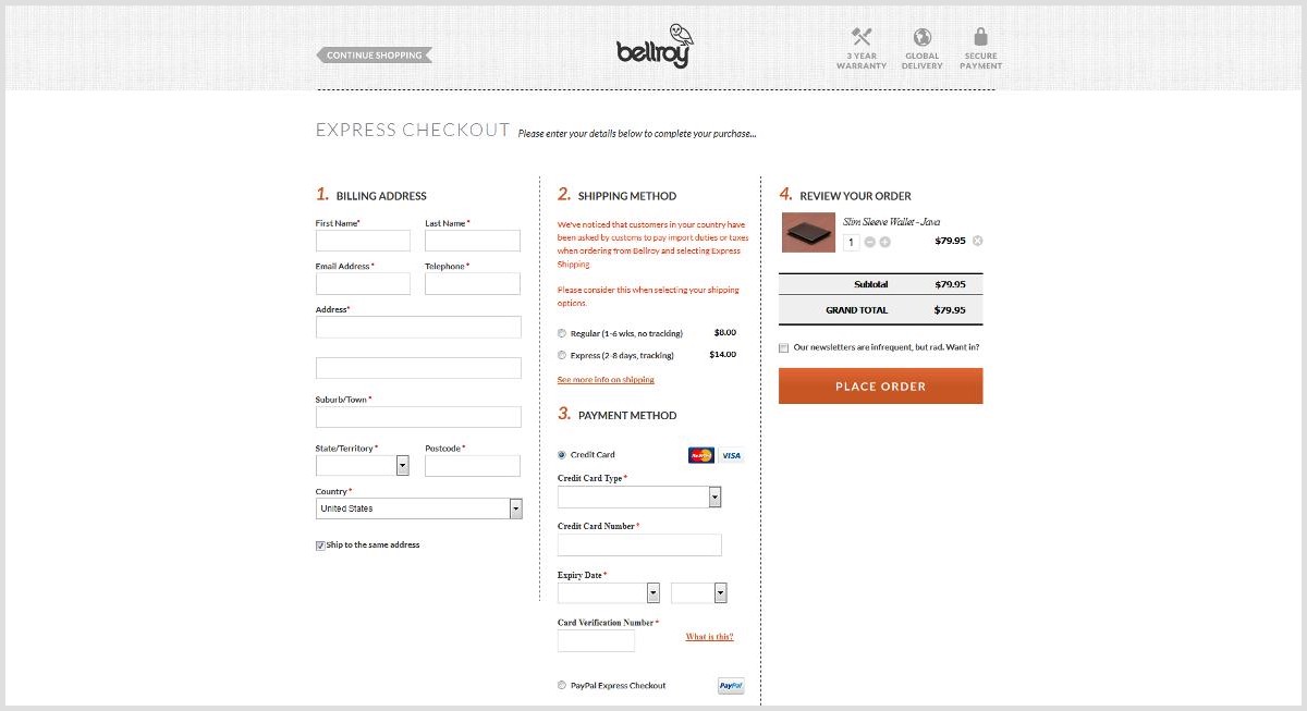
The first example is from Bellroy.

Source: siliconithub
They faced an increase in the cart abandonment rate due to the complex checkout process. To handle it, they came up with a single-page checkout process. Users can provide all the details, including billing, delivery, payment, and shipping options, without moving out.
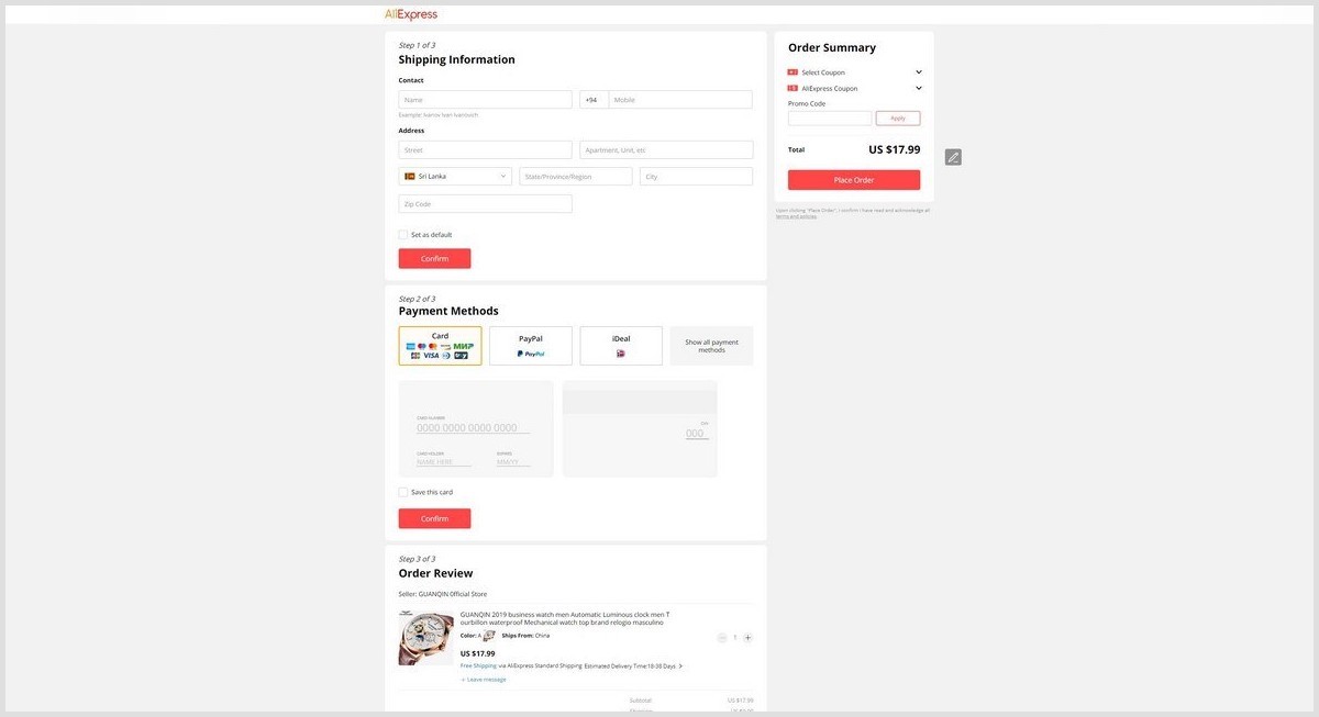
Another example is from AliExpress’ Checkout Page.

Source: ecommercebooth
It offers simplicity as the most important feature. The checkout page is divided into 3 steps and collects minimal information – shipping details, payment, and checkout.
Thanks to this, customers are not confused about the steps left in the final checkout. They can easily fill in the information without any confusion.
Advantages of One Page Checkout in Magento 2 Mobile App
We saw what one-page checkout means and how it’s better than multiple-page checkout. However, while deciding if it’s best for your eCommerce platform, you need to consider the checkout experience you want for your customers. Take note of design features and layouts, consider customer feedback and tailor it to suit the users’ requirements.
That being said, there are numerous benefits of using one-page checkout for your Magento 2 mobile application. Here are a few of those reasons:
Fast Checkout
Customers don’t like lengthy processes or waiting in line. They want a fast and quick checkout, whether it’s in-store or online. If it’s not, they are likely to abandon the cart. You don’t want that to happen. Hence, offer a one-page checkout because it keeps the checkout short, simple, and appealing.
Suggestion: According to Baymard Institute’s research, the average checkout flow has 5.08 steps. Aim for a checkout process that does well in less than 5 steps to beat your competitors.
Ease of Use
A one-page checkout process is easier to use for customers. The limited fields and steps prevent confusion as users can easily identify what information they need to provide without going back and forth.
Suggestion: Allow guest check-out with limited information like email address, name, contact number, and shipping address.
Smooth Navigation
With single-page checkout, your customers don’t have to wait for page loading. They can simply fill in the details and make payment without navigating through multiple pages. Whether it’s traditional one-page checkout or accordion-style design, they can navigate smoothly.
Suggestion: Simplify the checkout by providing multiple payment options and a clear checkout button.
Lower Abandonment Rate
According to HubSpot, a one-second delay results in 7 percent reduction in conversions. Hence, optimize your Magento 2 mobile application checkout for better conversions. Too much information can overwhelm customers. However, single-page checkout asks for required details only, and that reduces the abandonment rate.
Increased Customer Satisfaction
Customer satisfaction is the key to business success. When it comes to shopping online, they want a quick and hassle-free experience. One page checkout ensures that by delivering amazing UX.
Suggestion: Increase customer trust by offering additional sign-up options like social login. Employ product review systems and offer discounts and promotions for a better experience.
Magento 2 Mobile App Builder by AppJetty offers one-page checkout along with other exclusive features. It’s a predefined framework of an app that helps you launch yours within weeks.
Types of One Page Checkout
One page checkout puts up everything on one page. Before we get into the design, let’s look at the three different types of single-page checkout to choose from.
One-Page Checkout
A one-page checkout covers all the checkout information, including user details, shipping address, and payment details, on one single page. It reduces the number of pages and clicks, resulting in faster checkout.
It allows users to fill in all information on one page. You can create this page in two different ways.
- Single-step checkout: Use one step to complete the checkout process. It can be a single-step checkout with one action being required or a single page with multiple fields.
- Single-click checkout: Use single click for checkout. Most of the apps today offer single-click checkout. However, billing, shipping, and payment details need to be entered first. One of the examples is Amazon.

Accordion Checkout
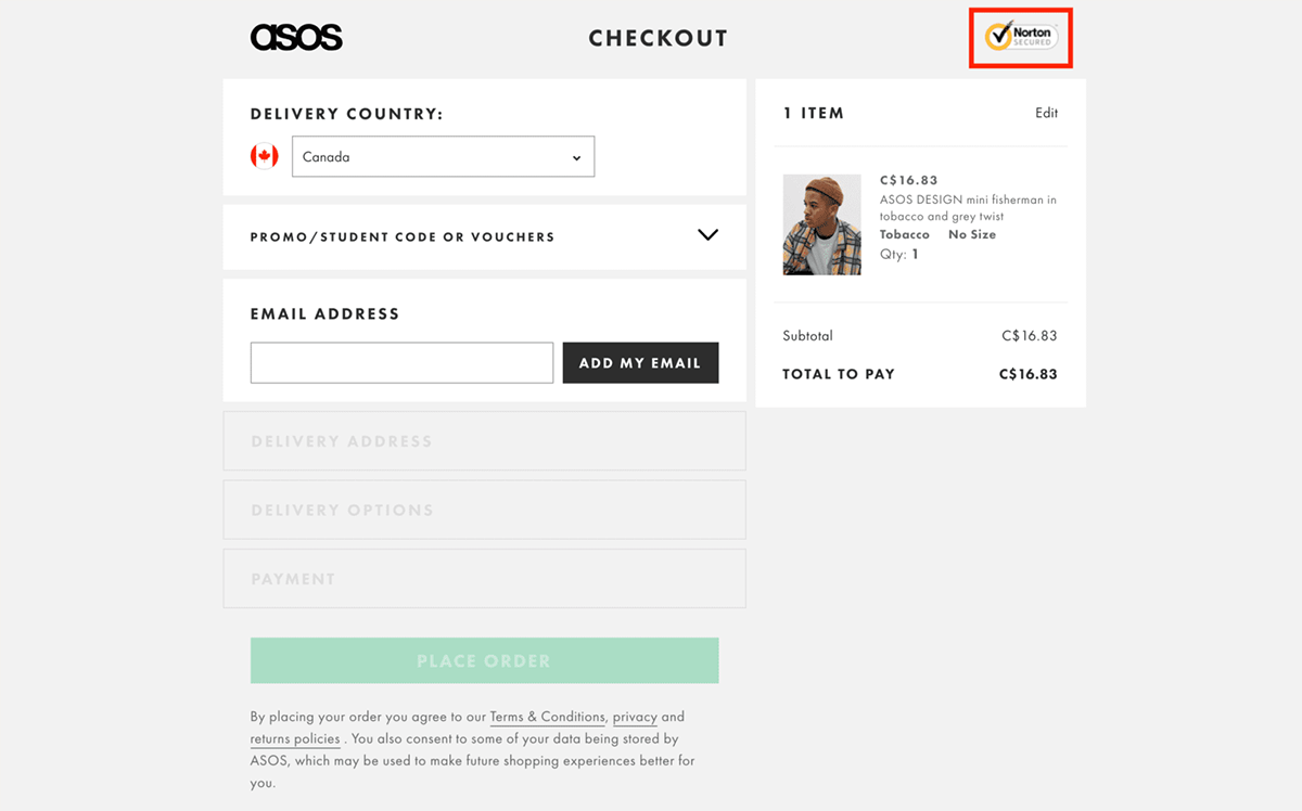
This is generally the fusion of one page and multiple steps checkout. Here the checkout steps expand as the customers progress. It shows one section at a time, and once all the details are filled in one section, the user proceeds to the next section.

If a user fails to add proper details, they are prompted to complete the steps before moving to another step. They can’t move to the next step unless the preceding step is complete. Big brands like Nike, Asos, and Glossier use accordion checkout.
False Single-Page Checkout
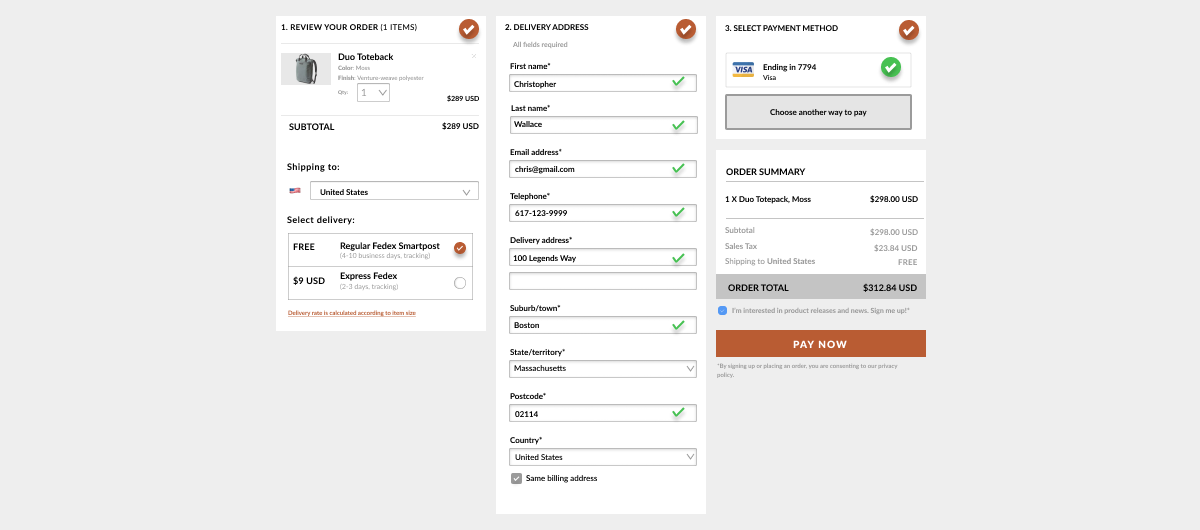
A false single-page checkout covers all the details on one page. However, the data needs to be filled in separately. Users can’t fill in the details in the order they want.
It only creates an illusion of single-page checkout. Here’s how it looks.

With MageMob App Builder, you can customize the checkout page in the way you want and do a lot more.
Checkout Page Best Practices
Improve site speed, build trust, and demonstrate value to increase conversions. Use one-page checkout and implement the best practices while designing the checkout page for your Magento 2 mobile application.
Allow Guest Checkout
Don’t force your customers to sign up or create an account before checkout. Registration creates an unnecessary step that slows them down or makes them reconsider if they want to proceed further. Hence, allow users to proceed simply by providing an email address.
Offer Multiple Payment Options
Integrate various payment methods. The more payment options you will provide, the more customers you’ll be able to turn. Start with a few major providers and expand as the business grows.
Simplify the Checkout
Provide a convenient, clear, and accessible process. Keep refining your checkout page. Remove unrequired steps and unnecessary fields. Streamline the checkout process to be fast and efficient.
Use Progress Indicator
If you’re offering multiple steps or sections, add a progress indicator. It indicates the steps of the checkout process and helps customers know where they are in the process. It gives them a basic idea of how long it will take to complete the process.
Use Data Validation and Input Error Notification
Add validations to the input fields to reduce errors and get more accurate details. For example, email validation ensures users add a proper email, number validation for a contact number, etc.
Apart from these, display customer reviews and take feedback to improve the overall customer experience. Connect users with customer support – provide a knowledge base, chatbot, live assistance, community help, etc.
Want to implement all these strategies in your Magento 2 mobile app?
All product and company names are trademarks™, registered® or copyright© trademarks of their respective holders. Use of them does not imply any affiliation with or endorsement by them.


